The Brief
Your Future Energy first contacted us looking for a fresh website design with updated content to better reflect the wide range of services they offer. This later expanded to encompass a full re-brand, with a completely new colour palette and logo designs being used. Their existing website was relatively basic, lacking mobile responsiveness, a number of service pages, and a portfolio section. In addition to tackling these issues, we were also tasked with improving both their organic search ranking, redesigning the site layout and sourcing new imagery. The final requirement was to provide faster hosting, and to set up new email accounts using their professional domain.
What We Did
After an initial meeting to discuss design requirements and preferences, we set about producing a completely fresh look with a greater use of imagery. To ensure that the site was as easy to use as possible for their team to use, the new site was built in the WordPress framework, making it simple to update and maintain. In addition to being mobile responsive, the new site also features a range of new content, including the updated service and portfolio sections. The final development stage saw us update and improve the site's technical SEO, to help Your Future Energy better target their keywords. With this complete, a new hosting and email package was set up, providing faster website speeds and professional email addresses for their team.
Results
The new Your Future Energy website looks and feels far more professional, with the previous white space and text being replaced by an attractive and intuitive modern design. In addition, the site is now usable across all devices, and features a plethora of new content to help inform and assist their users in making the right clean energy choice. In keeping with the more professional image, the new faster server and professional email addresses provide greater legitimacy and trust amongst their clientele. Lastly, with their faster server, updated content and SEO updates, the site now ranks far higher across all search engines, and their analytics data has the increased traffic to prove it!
How It Looks
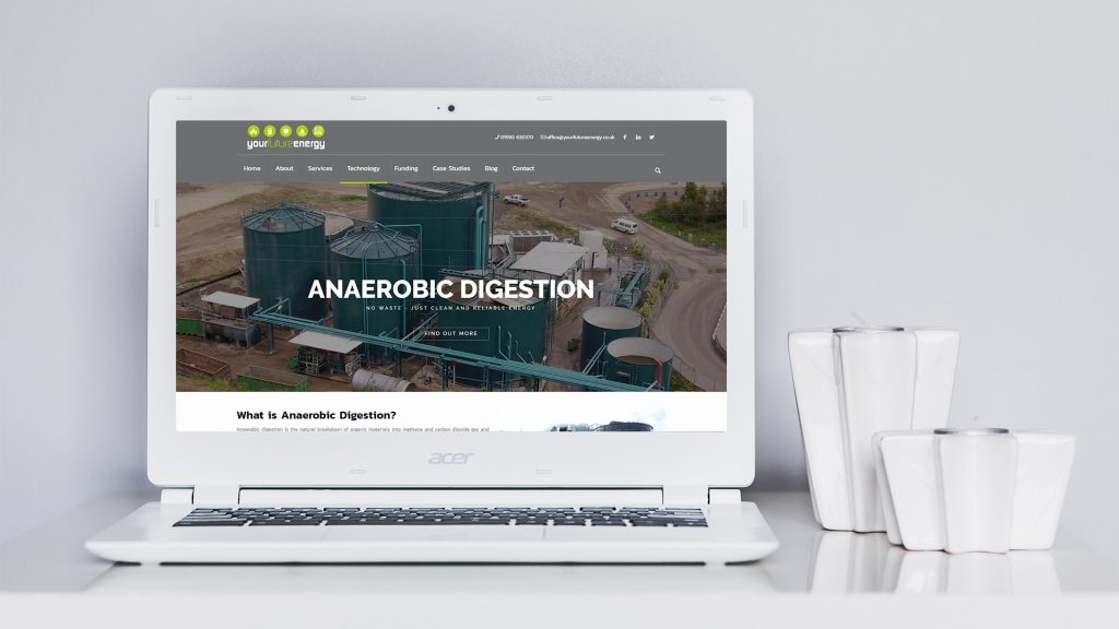
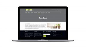
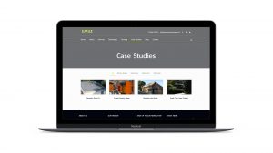
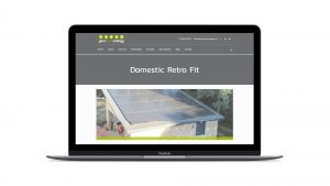
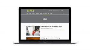
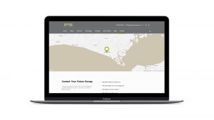
The Your Future Energy site focuses on clean design, making use of dark colours and spacing, which are offset by bright and vibrant stock imagery. View more by clicking the images below.


